This angry-photographer-post's theme: landscapes. Now, landscapes are a bit tricky, because it can be difficult to make them interesting. Landscape photos are similar to landscape paintings, although they take a lot less time and skill. When you take a good landscape picture, though, you take a good picture. I don’t profess to be on the level of Ansel Adams – far from it – but if you want some inspiration, take a look at some of his works.
There may be several reasons for you to take a picture. One is that the landscape is so beautiful and you want to capture it. Another reason is to show your friends back home. Whatever You're doing, you're probably more concerned about taking the picture itself and capturing it for later than enjoying the scenery as you pass through it. I am, anyway, and it heightens my awareness of a need to constantly capture and store. In the end, I'll have nothing save a few empty - but well-taken! - pictures.
 |
| What Spain looks like. Remarkably similar to Home. |
This is not a very good picture. It is flat and static, there is not much depth, and the plateau cuts the picture neatly in half. You should not show pictures like these to your friends and family. Yes, they might document what the Spanish countryside looks like, but again, not that interesting. Don't even take them. Okay, maybe you can take them, just for your own personal benefit, but don't show them to anyone.
 |
| Can you believe it? It's the same country! |
Okay, this is better. Note the difference between the tree in the foreground and the mountain in the background, complemented by the road on the left, which leads into the distance. More interesting, yes.
The astute reader will realize that I have already posted some of these pictures before. However, not all of them.
 |
| "1" |
 |
| "A" |
 |
| "Rhyme and Reason" - If you can correctly guess the inspiration for the these photos' names, I will write and/or dedicate a post to you. |
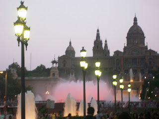
Now, these are not necessarily landscapes (would you call them architecture?), but they illustrate themes I wish to discuss. In the first picture, there is a lot of depth leading from the nearest fountain to the art museum on the hill. I really like the line the spumes make, but the photographs are a little flat still. This is a good photograph, but it could be better.
Take the second photo graph. We still get a sense of depth, and a sense of expectancy, of emptiness, in the sky, but there is too much sky, and it makes the fountains and the building on the hill too small.
I really like the third picture because it keeps the distance that we saw in the first photograph, leading your eye towards the building. However, it also gives the composition a "U" shape - your eye sees the first lamp, dips down and follows the lamps, and then rises again to see the building. However, even this picture is not perfect - the soft glowing light of the first lamp gets lost in the sunset. The other lights contrast enough with the scenery to be considered acceptable.
Also, I'm so glad that I don't run any ads on this site. Otherwise, I might have to check about copyright issues, especially with things like Ansel Adams photographs. Typically, you don't have to ask permission if it's for personal use and if it's for free educational purposes.
Speaking of Ansel Adams, if you want to name-drop a niche-photographer among your friends, I suggest Tillman Crane. When I was younger, I confused him with Ansel Adams - they both have such artsy names befitting photographers. He taught my siblings photography when they were in high school
Yes, I support local artists. For more interesting art, look at Nathan Florence. He taught me art when I was in high school.

Actually the plateau picture is not that bad - perhaps it just needs a liitle ooomph? Good post!
ReplyDeleteI like the first of the fountain pictures most; it feels more dynamic, like the action of the water could restart at any minute.
ReplyDeleteBut of course, artists are their own harshest critics. ;)